Some of the sharper customers, and those who've bought newer products, may have noticed that there's been a different kind of logo on product packaging, for example, and here and there.
For years we've wandered the world with nothing but the VALCO wordmark. It worked well enough, because typography rarely causes anyone trauma. Unlike our old “original” trademark. It looked so pathetic that we quietly got rid of it and hoped nobody had time to take a screenshot.
But when a company grows, you have to face facts: a text-only logo won't carry you forever. Especially if the long-term plan is to build our own Death Star, conquer the world, and force humanity into serving us.
Symbols are powerful. They stick in the mind, they burn themselves onto retinas, they end up on flags, on tank turrets, and eventually in the history books. Usually for reasons nobody can explain afterward.
We wanted a symbol of our own. The kind that, 100 years from now, illiterate small-time crooks will scribble on metro toilet walls and decent people will learn to fear.
Briefly: we needed a mark we can slap on packaging, products, sleeve patches, and eventually on the side of laser weapons somewhere in the Orion Belt. This mark has to stand the test of time, and radiation.
We didn't use AI (this time)
We decided to do something very unusual for us: we paid actual money for the logo instead of telling AI to hallucinate a “symbol for the side of the Death Star”.
The designer we ended up with was Pekka Nokelainen, because he happened to show up at the railway station bar where Henri and Jani, over a couple of beers, were thinking that a new logo would be pretty cool.
Luckily, Pekka is a man who understands the core of the Valco brand: maximum billing with minimum effort. Pekka describes his design process like this:
“We noticed right away that the client had a sense of humor just as twisted as our own. Jallu must've gone down pretty well, because the next morning we didn't have a very clear memory of what we'd agreed on for the logo.
The goal of the project was clear: do as little as possible and bill as much as possible. A Rolex remained a dream, but the fee did buy a few beers.
Somewhere I saw the Left Alliance logo and thought that if I split that in half and add a line, nobody will notice.
Looking back, the end result would fit best on the side of an East German sneaker, but surely it'll win some kind of design award anyway. I'll stick it on the wall of the summer cabin outhouse next to the previous ones.”
We figured it was worth paying for Pekka to plagiarize a political party's logo for us and not even bother touching the wordmark. You have to admire that kind of combination of genius, audacity, and laziness.
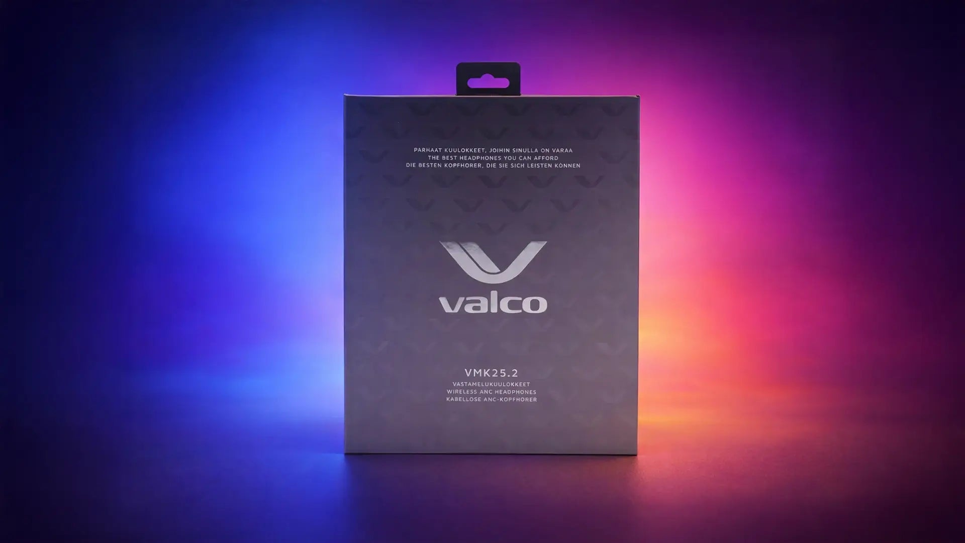
So we asked him to redo all the packaging while he was at it. Which means the new product packaging is also Pekka's handiwork.
So what the hell is that logo supposed to be?
The new logo is minimalist, retro-futuristic, and just the right amount of vague.
- One sees the letter V in it, as in Valco.
- Another sees a headphone headband.
- A third one sees plagiarism made from a political party's logo.
- In theory, someone could also see a Finnish swan flying away from here for the winter.
- One guy at our company sees a penis in it, but he sees those everywhere. We've tried to get him help. No luck.
To us, it's first and foremost a mark that looks like we know what we're doing even on the days when we absolutely do not. A better logo makes everything look a bit more expensive, and in business that's always a good thing, because money is still very much required.

What next?
Valco is growing. When you're shipping electronics seasoned with Finnish humor out into the world, it's good to have a symbol that's simple, recognizable, and above all registered as an international trademark.
The new logo will be showing up on future products, packaging, the online store, and everything else that stays still long enough for us to slap our logo on it.
And if you don't like this logo, that's fine. We want to make sure you'll be seeing it on every possible thing for the next 30 years, so you'll inevitably get used to it. Resistance is futile.
— Valco, the world's friendliest evil corporation
Share with friends
The identity crisis of the world's friendliest evil corporation
The Death Star dream suffered a setback